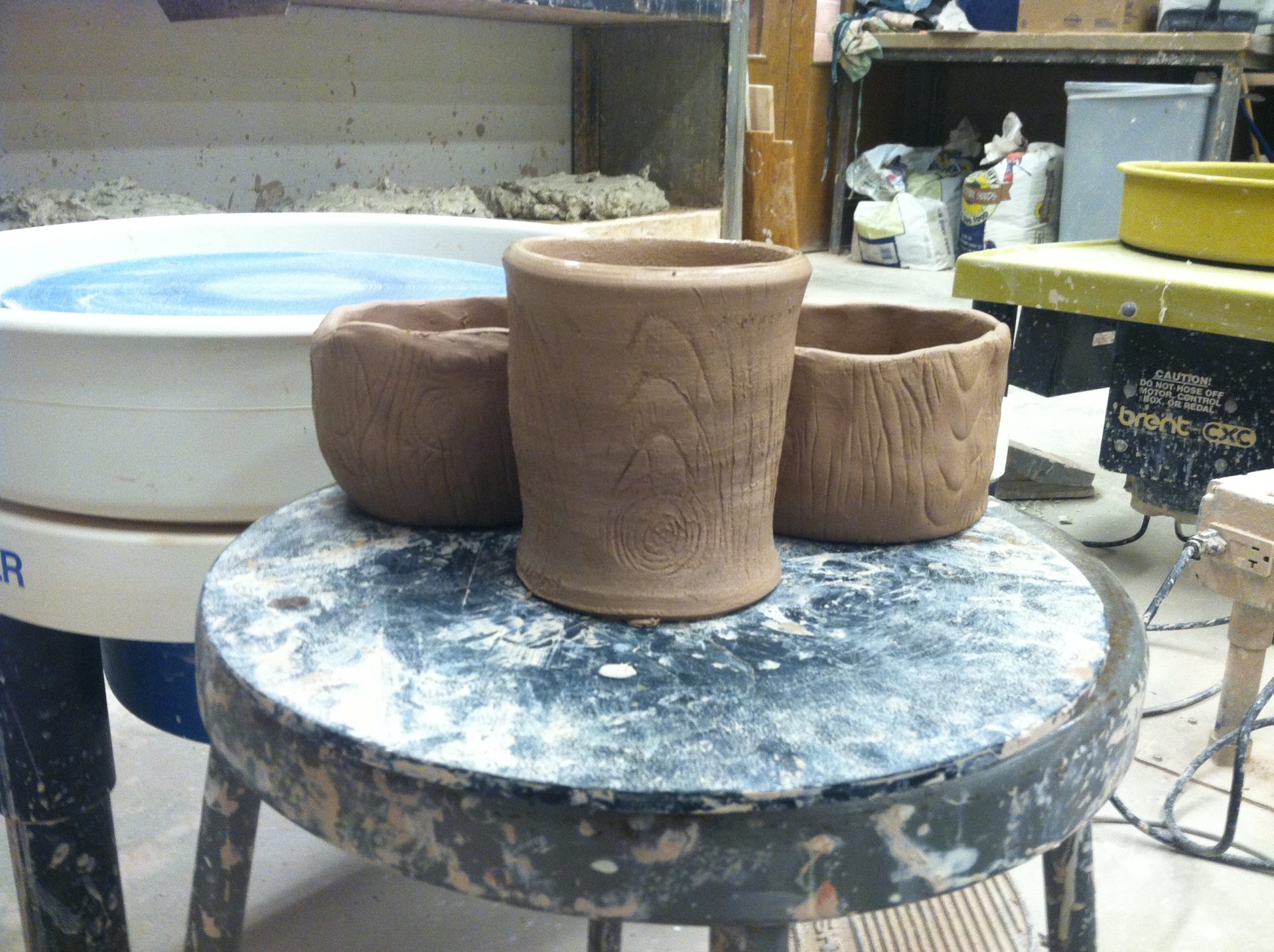
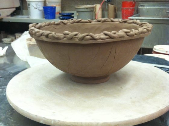
I just boxed up the remaining pottery that didn’t sell this summer. I’m looking forward to starting back up with it in the spring. I’ve already received a few inquiries for commissioned dinnerware. The thing I like most about ceramics is that it’s not complicated; one doesn’t sit down and ponder on a piece for hours to throw it away later–at least, not usually. Drawing and painting is a different story. Pottery is all about form, shape and function.
It took me five months to develop a style that I liked, and just when I was figuring out what I really liked to make, school let out for the summer. Here are the glazes I’m set on using next year:
- Carbon Trap Shino (dipped and pour patterned, mugs look even better with Bruno’s White used as a liner)
- American Shino (however I can get it to go more creamy white than orange)
- MacKenzie Grey Matte (with the rose and green accents from glaze leeching)
- Phil’s Yellow Matte (quick dips so it gets a stony look)
- Candy/Always Red (if I can get it to fire right… it never turns out red, but it would look amazing on my mugs with the finger spots on top)
- Dave’s Special Celadon (sometimes with iron stain)
- Coleman Celdadon
- Yellow Salt
- Woo Blue (sometimes over Shiges Black)
- Mathias Blue
- Plum Iron/Tenmoku (inside/outside)
And when that’s all said and done with, I’d really like to experiment with Peach Blossom. There’s a few others I’d like to try as well, but not many that are in the current line-up of studio glazes. It’s my goal to either get a piece into the spring art show or be immortalized with a glaze with my name on it. Only time will tell.


